Web Designer
Mind Forms Blog Design
Design Brief
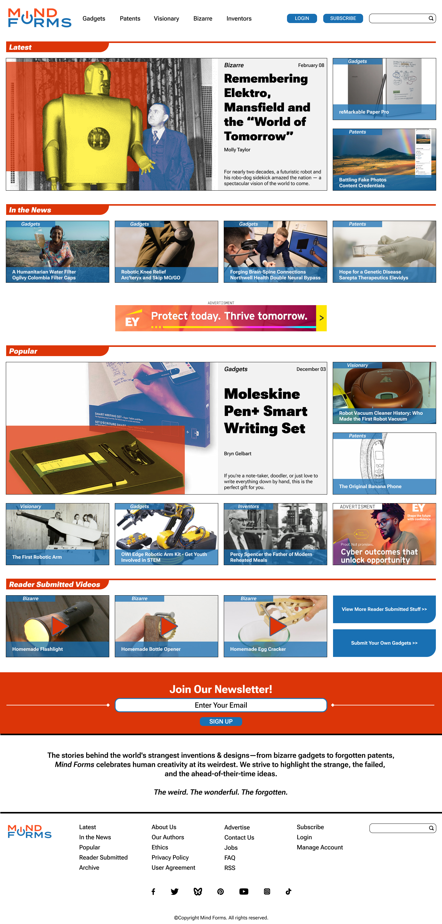
I was tasked with creating a blog design and layout for both desktop and mobile, with standard blog elements, such as:
- Logo
- Category Navigation
- Utility Navigation (Login/Subscribe/Search)
- Featured article section with a unique/ownable and repeatable image style
- Two other ways to display articles
- The image style must also be present throughout the blog
- Other content, such as videos
- Have a place for a few ads
- Newsletter signup
- Blog description with the blog's tagline
- Footer should have category navigation, other site navigation, socials, and copyright
- Submission section for users to submit their finds
The Brand and Creating Branding
I was given the made-up brand "Mind Forms", and would need to create branding for them, along with the blog layout.
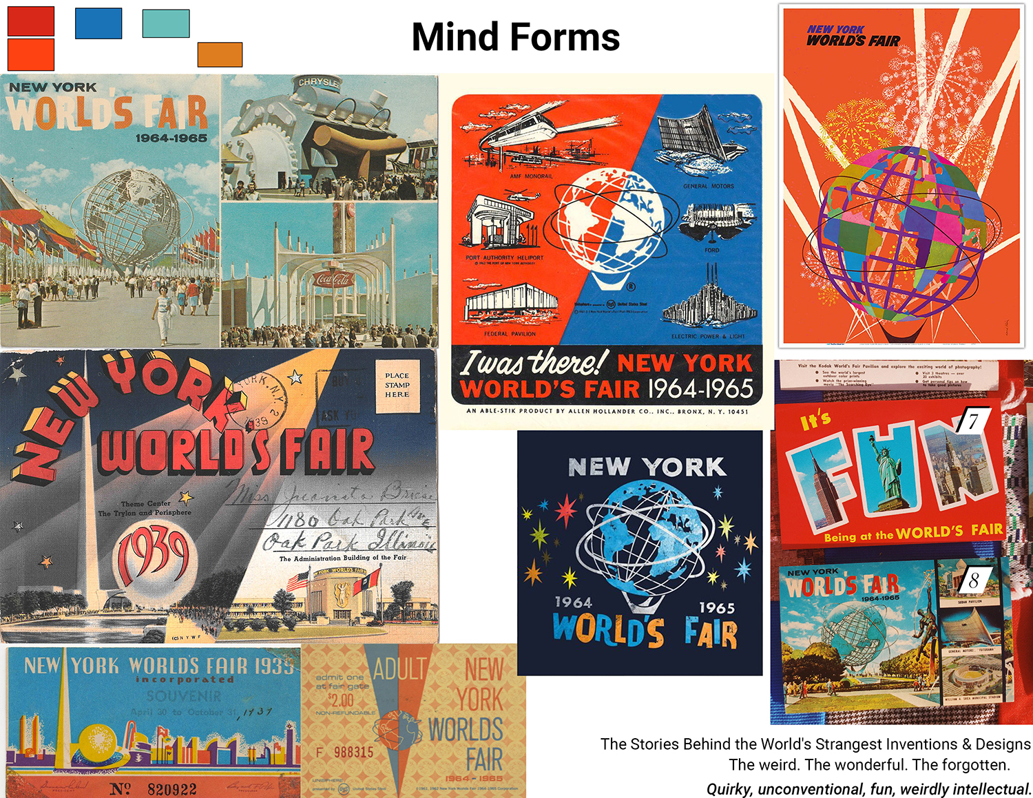
Based off the blog's tagline "The weird. The wonderful. The forgotten.", I decided to go with a event that I wish I could have attended that was basically a show of the same idea--showing the unique and wonderful world of the future with inventions that would change the world, The World's Fair. I loved the style of The World's Fair theming, so I based my mood board and soon to be style off of that.
Logo Design
Next I would design a few logo ideas, playing with wordmarks mostly.
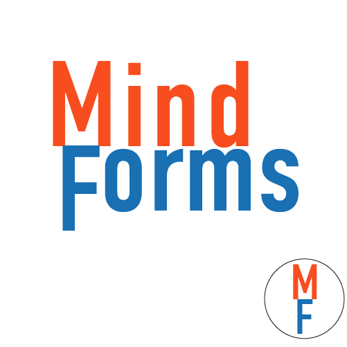
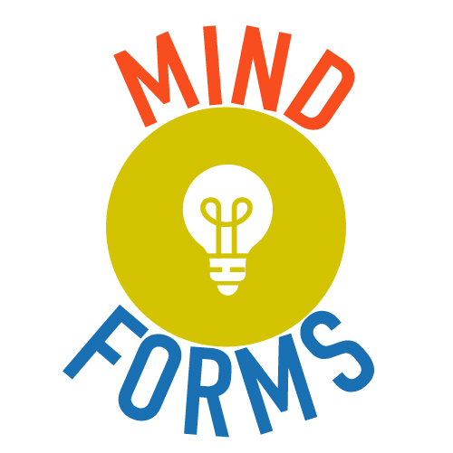
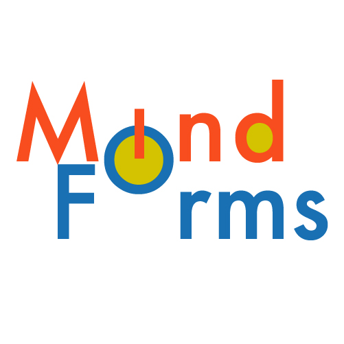
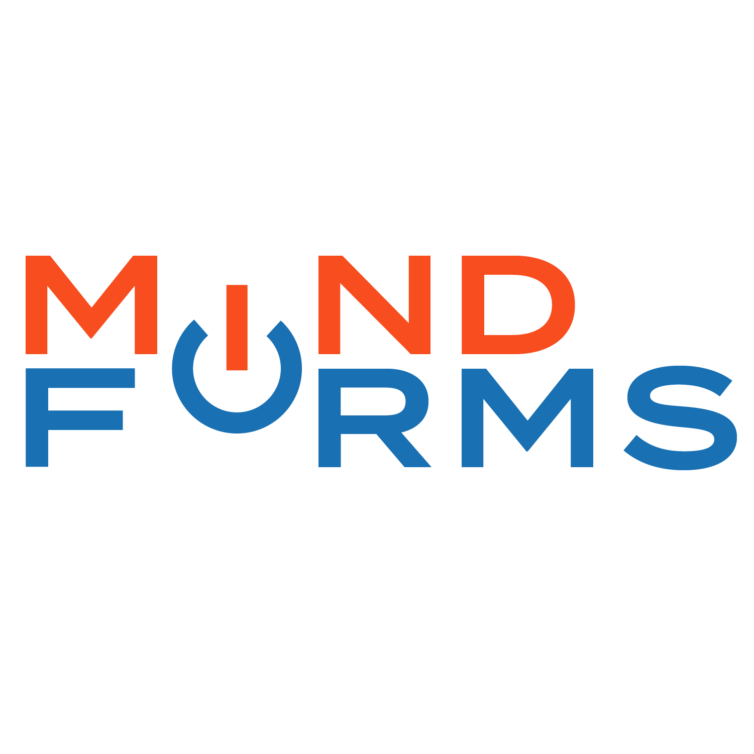
I wound up going with design 4, and mostly dropping the yellow color from the overall style, but keeping it for accents on featured images. From Design 3, I really liked the I/O power symbol in the design, so I wound up simplifying it and keeping it in design 4. The I/O power symbol would wind up being good for the favicon for the blog.
Designing the Blog
The following steps I don't really have in-progress works, as I designed everything in Figma, so instead I will just skip to the final desktop design. I was inspired by other blogs with similar topics.
Mobile Design
And the mobile version... (Note that the client only wanted the homepage designed, not the other pages.)
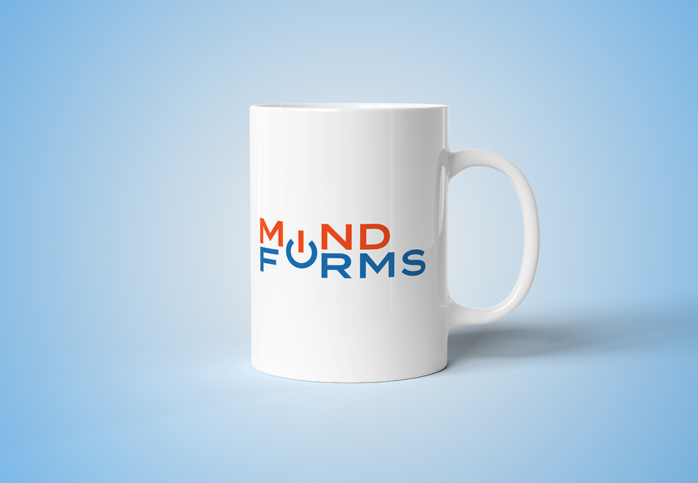
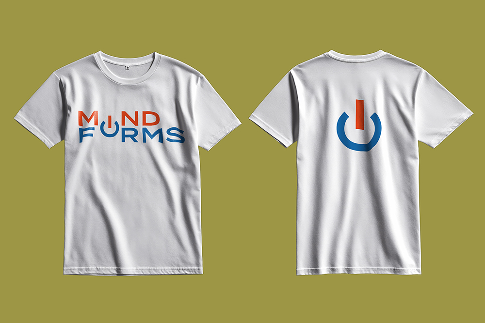
Merch Designs
Finally, the client wanted to see what merchandise would look like with their branding. I created a mockup of a mug and a t-shirt with their branding.